As the year comes to a close, more and more people are looking to reinvent themselves, hit the gym and look their best self. Weathered properties need that too! Let us introduce you to a new way of looking at colour in the Industrial market.
The urban dictonary defines the double rainbow as “intense joy, coupled with extreme emotional shifts; an experience equal to an orgasm.” Not sure we’ll get your rocks off, but we’ll be able to introduce a new way of looking at colour in the Industrial market.
REASONS TO UPGRADE:
Repositioning of assets, increasing overall property value
Achieves branding consistency across property portfolios
Promote safety through signage and way-finding
Extremely easy and immediate way to reinvigorate your property
AN EASY FIX
One of the cheapest and most effective ways to upgrade existing property assets is to slab a coat of paint on top of the exterior façade.
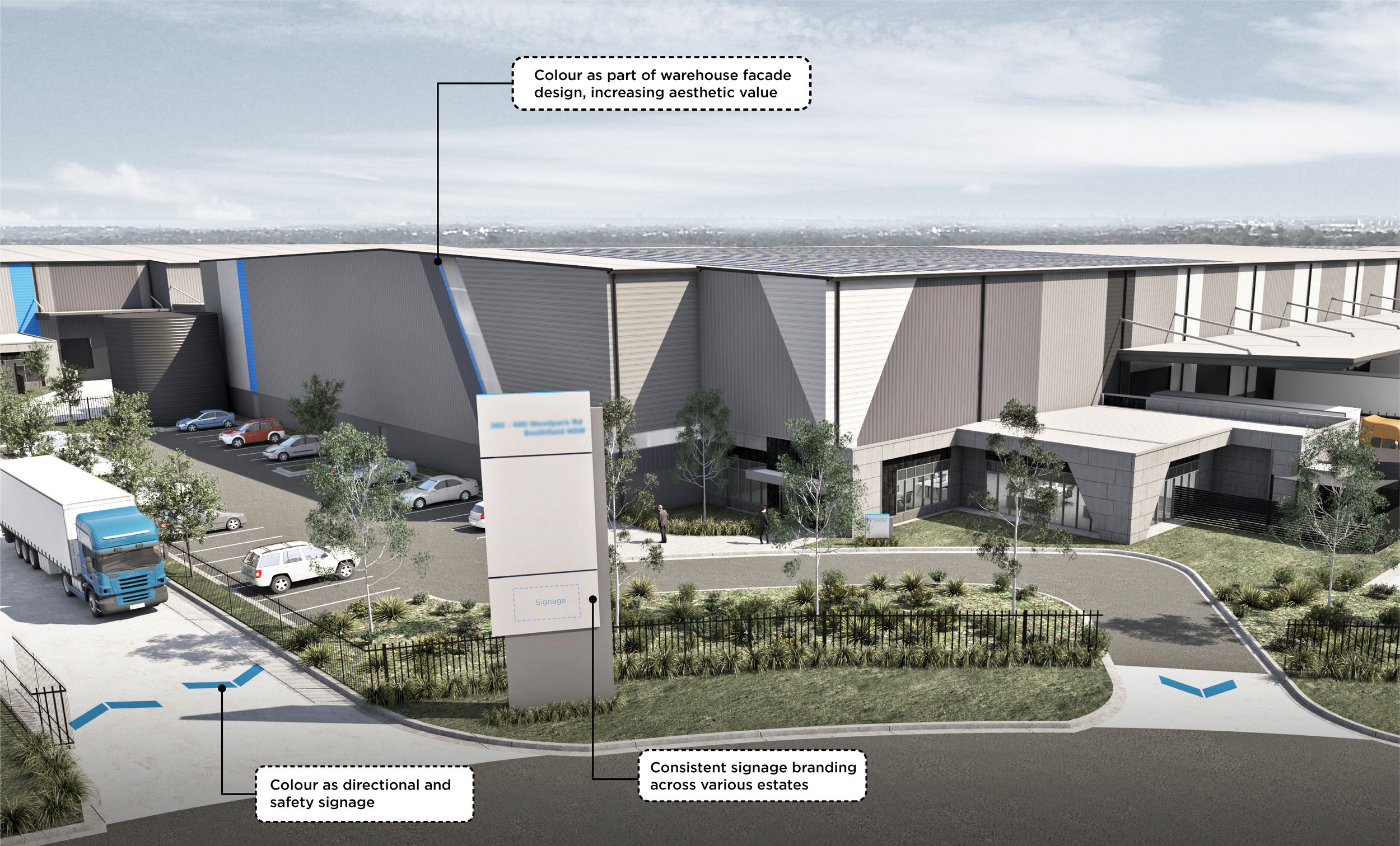
Using colour in a visually engaging way increases the aesthetic value of the property - and is generally a little extra factor that many users tend to look for when leasing a new warehouse or commercial space.
We know that the industrial property market is looking hot, so how do we uniquely upgrade our asset portfolios in a distinct way? You guessed it... pattern and colour!
CHECK OUT THIS BEFORE/AFTER TRANSFORMATION OF HENDRA DC:
Before: no definitive character, weathered, unimpressive
After: bold, creative, high aesthetic value
To see more on what we did at the Hendra Distribution Centre, click here.
MARKING YOUR PLACE IN THE MARKET
The phenomenon of optics allows us to subconsciously recognise brands instantly through a distinct colour and/or font.
Our tip: use your primary branding colour throughout property assets, including directional signage.
SAFETY FIRST
We sometimes consider safety as a solely a functional necessity, but what if we could use it as a placemaking strategy?
Our tip: Use bright safety colours against a monochrome or neutral palette.
Contact us to upgrade your next property.


